Three Steps to Stylised Drawings
At my most recent Drawing Play-Date, I gave a demonstration to show the main things I consider when drawing animals in my illustration style. Even though these are by no means extensive nor prescriptive, I thought I’d share the demo in written form just in case something in here might prove helpful to you.
The theme of the day was Southern African Animals, so first: photo references.
Screenshot from my Draw and Play Pinterest board. (Ignore the cycles, they’re for another day.)
If I’m going to draw an animal as a character for a book, I usually draw that animal many times, from all angles, from photos, videos and real life if possible. But this time let’s just draw a zebra from that photo above using step 1:
Shapes
This is just a technique to help us draw something without tracing. A little like in those awkward “how to draw…” books where you draw some circles, an oval, join them with some lines and ta-da! You’ve got a zebra. Except this technique is not about following someone’s instructions, it’s about a way of seeing. After a lot of practice drawing things all the time, we start to see the shapes that things are made up of, and this simplifies and speeds up the drawing process.*
Very roughly drawing shapes that I see in the zebra. This helps to keep things in proportion, and you can be as scribbly and messy as you like. In fact, I encourage it.
Another helpful shape-method I used is to sketch out a box with a few lines, just to plan out where the whole animal is going to fit and keep it in proportion. This also prevents any bits of the animal falling off the page.
Then, with a rough, scribbly shape to work with, you can draw the darker, more confident lines:
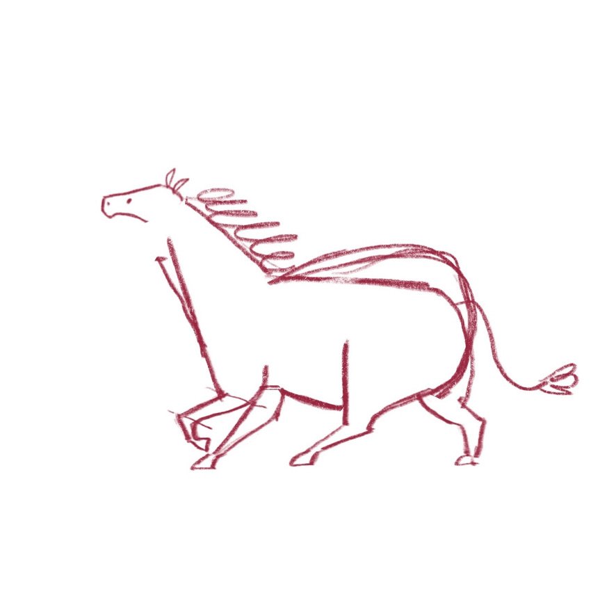
The boxes came first, then the messy sketchy stage, and then the zebra (or horse as it appears now).
Lines v. Curves
The next thing I think about when stylising an animal - or anything really - is what I call lines versus curves. This is where I consider which curves I can highlight, and which curves I can turn into lines - and these will preferably be opposite one another.
The orange version is the previous sketch, and the black shows where I’ve created more straight lines and where I’ve accentuated the curves. It will be more obvious in the next step…
Exaggeration
I think this is most people’s favourite step, don’t you?
Here I’ve used some digital tools to make it obvious how I warped, stretched and shrunk parts of my zebra - accentuating his bottom, shrinking his head, and making his legs more stubby. I’ve also lifted his head so that he’s looking up a bit.
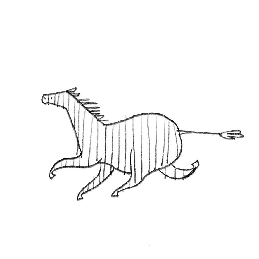
Then I made his legs all bendy to fit in with my usual style of spaghetti-limbs, threw his ears back, and straightened his tail (just for the fun of it). Oh, and finally included those vital stripes.
I did another version - going through the steps without looking at the first one - and this one ended up with a happy facial expression and a shadow so that it looks like he’s prancing so gleefully he isn’t even touching the ground.
I hope this has been of some help, or encouragement, or amusement at the very least. Do get in contact if you have any questions. I’m happy to chat about drawing.


